A New Look

This week's post on album art looks at Jennifer Griffith's contribution to a particular reissue series from Blue Note Records that lasted from 1979-1981.
Griffith's photograph for Jimmy Smith's Confirmation (Blue Note LT 992)
Blue Note LT Series
The LT series often featured material that Blue Note had previously not released, which reflected their uncertain status at that time. Liberty Records had purchased Blue Note Records in 1965 and the label grew increasingly quiet in the coming decade, to the point that from 1979-1981 Blue Note only had a presence on the market as a reissue or rare material label, at the behest of their owners Liberty/United Records, Inc. (and eventually EMI). Blue Note resumed active label status in 1984-85 and would start to issue new recording sessions, but until that time they relied on drawing from their vault throughout the 1970s.
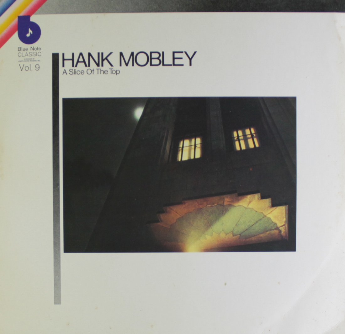
A generic aesthetic format for the LT series album covers was developed which featured a centralized, photographic image surrounded by a field of white and a rainbow logo in the top left corner. A diverse array of talented photographers were chosen to fill the image blocks, among them Jennifer Griffiths. Her haunting nightscapes used in the LT series reflect just one small aspect of a very diverse career in the visual arts.
Jennifer Griffiths
Griffiths actually won an award for her Blue Note album art series, being given an Award of Merit by the Communications Arts Society in 1981. These photographic works were mostly dramatic, modernist views of the landscape, but Griffiths has consistently been drawn to the cinematic even when working in other media. Her paintings of theater interiors are, perhaps, the most explicit example of this and you can see much more of Jennifer's work on her website.
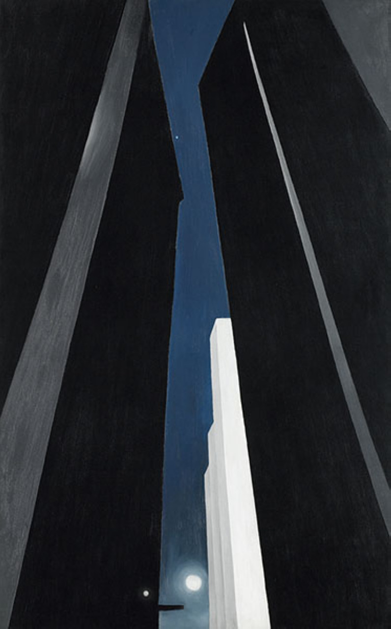
Some of Griffith's Blue Note photographs, such as those for Slice of the Top (Hank Mobley), or Vertigo (Jackie McLean), are reminiscent of the urban-scapes of Georgia O'Keeffe. Both exhibit a highly cropped view of man-made structures complemented by an almost eerie light source. Speaking more broadly, this comfortability of moving between painting and photography with a common vocabulary reflects Griffith's own larger career practice.
Griffith's design for Hank Mobley's Slice of the Top (Blue Note LT-995)
Georgia O'Keeffe, Lake George Window, 1929
Griffith's design for Jackie McLean's Vertigo (Blue Note LT-1085)
Other works, such as the photographs used for Jimmy Smith's Confirmation, Dexter Gordon's Clubhouse, or Donald Byrd's Chant, have a more contemporary than modernist feel, almost prefiguring the high drama often on view in Gregory Crewdson's heavily staged photographs from the early 2000s.
Griffith's design for Dexter Gordon's Clubhouse (LT-989)
Gregory Crewdson, Untitled (empty house), 2001-02
Gregory Crewdson, Untitled from the series Twilight, 2001
Griffith's design for Donald Byrd's Chant (Blue Note LT-991)
We end this post with Jennifer Griffith's design for Donald Byrd, but we'll pick right back up with Byrd in our next writing and look at some very cool cars.


